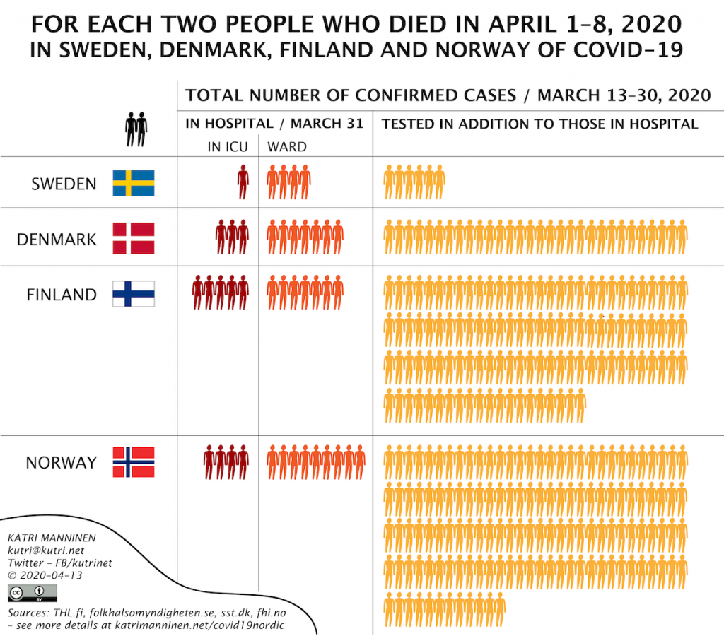

I have been tracking the progress of Covid-19 aka coronavirus in Finland, Sweden, Denmark and Norway for the past month or so.
It has become clear to me that Sweden deals with Covid-19 very differently than the Nordic countries around it.
They test less per capita than others and have more deaths per million people than Denmark, Norway and Finland.
I’ve also noticed that the ratio between deaths and patients in hospitals and intensive care units differs in Sweden from that in its neighboring countries.
In the illustration above I attempt to visualize these differences between the above-mentioned countries.
I know my calculations are far from perfect – they are just meant to give an idea how the number of confirmed cases, hospitalizations, ICU patients and deaths relate to each other in Sweden, Finland, Denmark and Norway.
I took the number of deaths as my ”comparison point”. Since Sweden has less people in ICU than who have died, I had to make the comparison number two deaths instead of one. I count the deaths between April 1st and 8th because those are the last reliable enough numbers I had on April 13th (although Sweden’s number of deaths may end up being higher – it takes them usually 10–14 days to update all deaths for a given day).
Finland and Sweden have been testing mostly people with clear symptoms and people who are working in hospitals etc. I’ve read reports that in Sweden even the health care workers have a harder time getting tested than in Finland. So my assumption is that most people in Sweden have been symptomatic by the time of testing.
It takes about 10 days from the onset of symptoms to be hospitalized and at least one week from hospitalization to die. That’s why I’ve included in my calculations confirmed cases that were tested up to a week and 10 days before the first deaths.
Since I don’t have cumulative numbers for hospitalized/ICU patients for all the countries, I’ll use the number of people in hospitals/ICUs on March 31st – a day before I start counting the deaths.
The best way to contact me is via Twitter, but you can also email me. The email address is in the image.
I’ve collected the data from official sources and also re-checked the later for changes.
Here are my Google sheets where I track various numbers. They are for my personal use, so parts of them are in Finnish and some of the data doesn’t necessarily make sense to others.